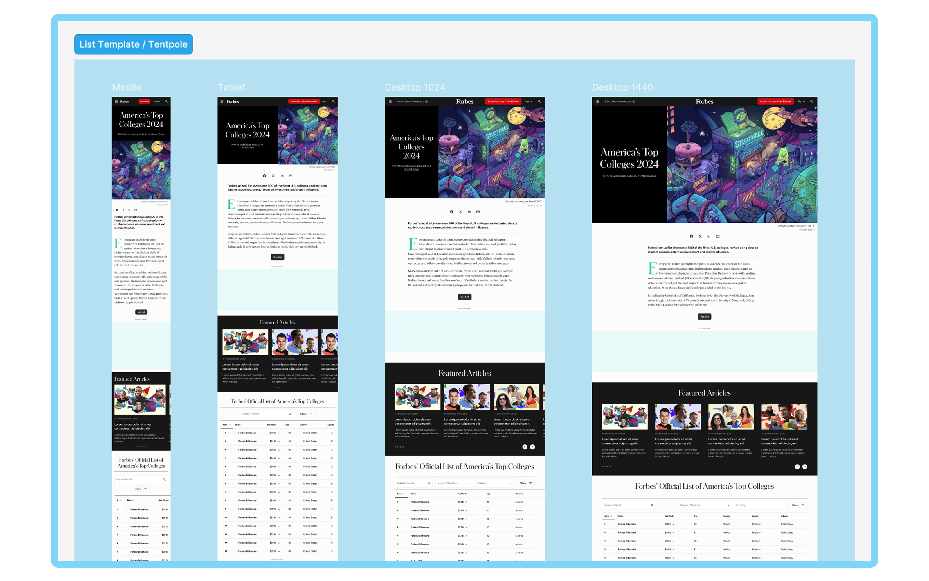
The list template's responsive design eases information consumption across device types.
Forbes
Role: Design Director
Duration: 10 months, then ongoing
Team: Myself, 1 Product Designer, 1 Engineering Manager, 2-3 Engineers
The list template's responsive design eases information consumption across device types.
Forbes publishes more than 130 lists each year. Even though these lists are thought of as a single product, each launch comes with a unique set of considerations that influence its content and design—varying publication frequencies, sponsorships, ranking methods, and subject matters (from people to companies to institutions). Some lists demand a dynamic, high-impact presentation, while others are more understated and straightforward.
These attributes led to lists being considered separately, instead of as a cohesive product. This case study explains how I unified our design approach to the list product in response to the challenges posed by variance, and delivered significant operational and user-experience benefits along the way.
The root issue with lists was the practice of cloning old templates to launch new lists. This often came at the request of our content teams, who wished to preserve visual elements from past launches. While this practice could sometimes save time in the short run, over time, it led to several issues:
Cloned templates introduced subtle visual differences that eroded trust with users.
The proliferation of templates with slight variations compounded the level of design and technical debt with each launch, escalating QA, engineering and design level of effort.
The small team responsible for list launches became overwhelmed, forced to juggle an ever-growing backlog of maintenance tasks alongside new product features.
The lack of a unified approach on the design and engineering fronts compounded complexity and hindered the team’s ability to innovate.
A unified list template sets a reusable standard that creates headroom for product innovation.
In order to address these challenges, I spearheaded a project to consolidate design elements across all list pages into a unified template.
I began by engaging with the content teams, who were as frustrated with list inefficiencies as we were. Through discussion, we identified that while the top of the list page—where users first land—is crucial for brand expression, roughly 90% of list page elements could be standardized without losing impact.
Because we agreed that 90% of list page elements could be standardized, I advocated for component-based design, with adjustable properties to allow for managed variance where needed, and parity between components in design libraries and the list app. In collaboration with a junior designer, I developed a set of about a dozen components specifically for lists.
To prevent bloating our core design system, I established a local library dedicated to list components. Although the list library borrowed atomic elements from the main library, it also allowed the team to review and manage list-specific components independently.
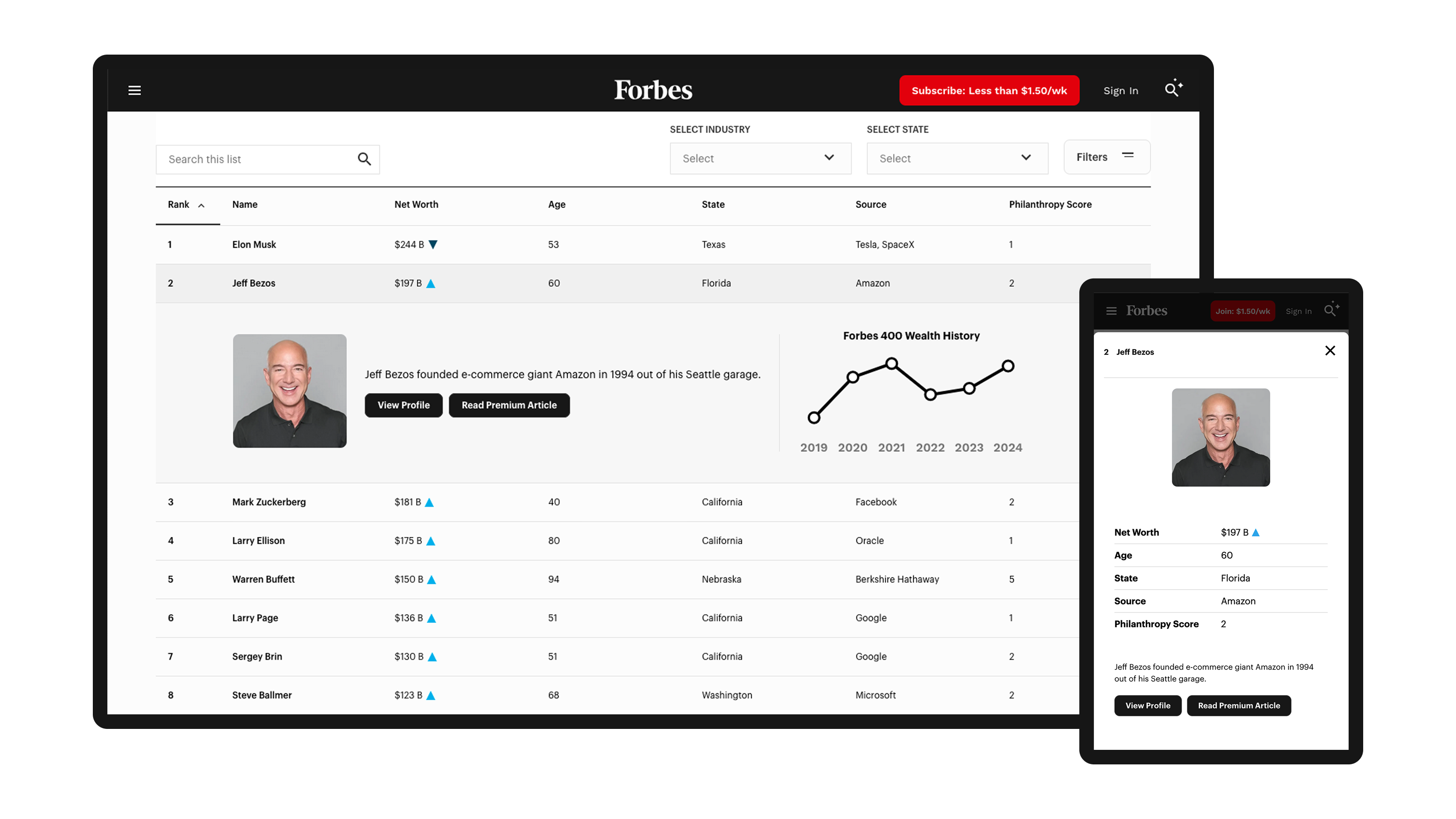
The list table displays rankings and other data and is the most crucial element of the list. It had suffered from “drift” due to ad hoc modifications. For example, high-profile lists like Forbes 400 and Billionaires had added left rails to their landers for the purpose of promoting content alongside list rankings.
However, user data revealed little engagement with these rails—plus, they hurt page performance by requiring extra JavaScript, and prevented the table from scrolling horizontally, which put constraints on how much list data could be displayed on mobile.
Redesigning the table to full width, and making it into a component with adjustable properties and parameters, resolved these issues and vastly improved functionality on mobile and the consistency of our user experience.
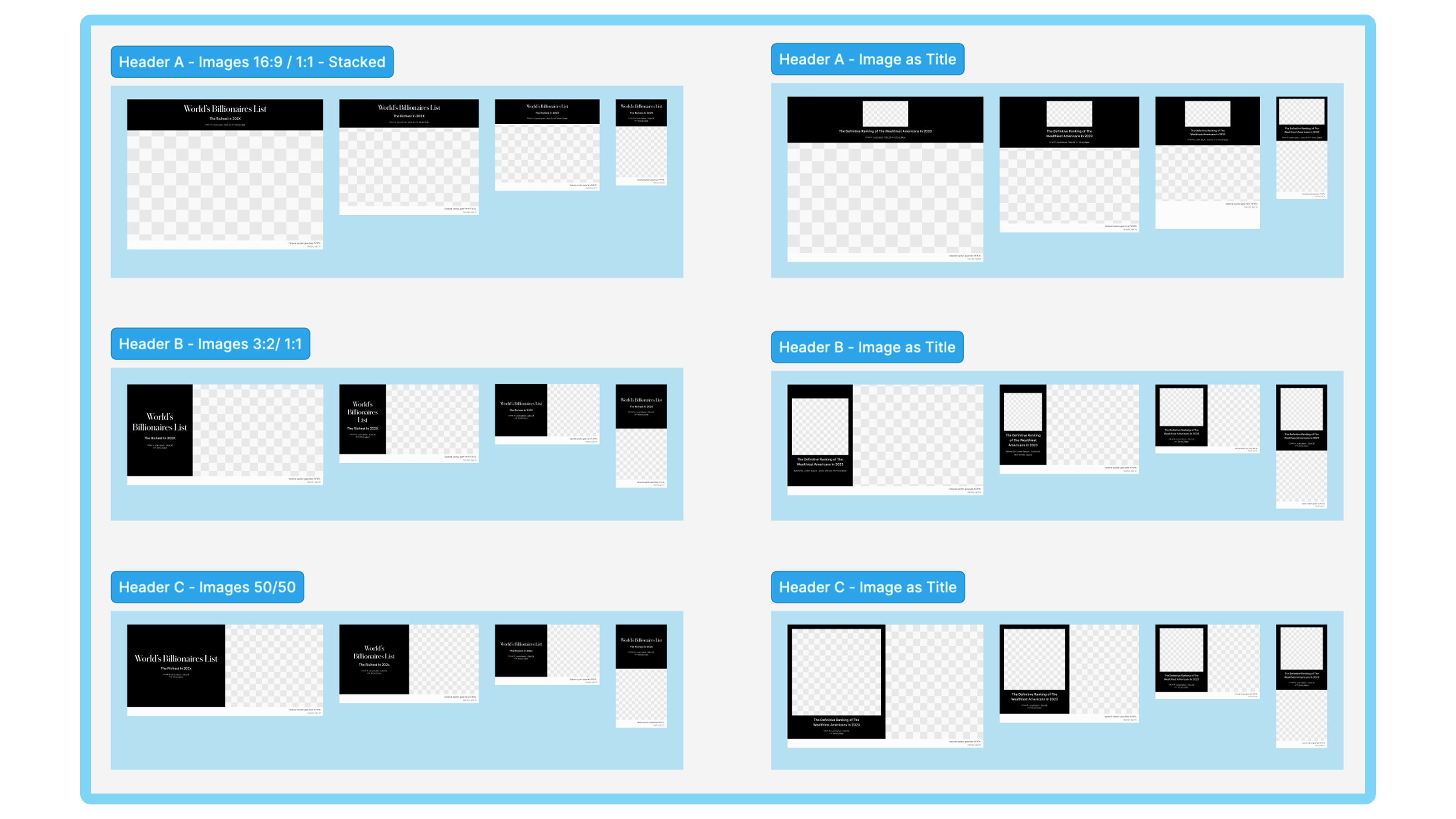
Components with adjustable properties preserve unique expression while setting guardrails against drift.
The unification of our list templates delivered clear, measurable benefits:
Standardizing 90% of page elements cut down on both design inconsistencies and technical debt, and simplified template maintenance.
Before unification, launching a high-profile list like Billionaires required 16-20 Jira tickets. After deploying the new, unified template, the same list could be released with as little as 2 tickets—a reduction of over 80%.
A configurable list table component enhanced mobile functionality—especially important given that 80% of our users access lists on mobile devices—while also improving overall performance.
A local library of list components ensures a cohesive look across lists, yet allows key brand moments (such as the impactful top-of-page elements) to remain unique.
Consolidating the codebase enabled the engineering team to more easily integrate new features and maintain the product, reducing redundant work and technical overhead.
By unifying the list template, I transformed a fragmented, high-maintenance process into a streamlined system that reduced operational burdens and enhanced user experience on list pages.
Copyright © 2025 Andres Jauregui. All rights reserved.