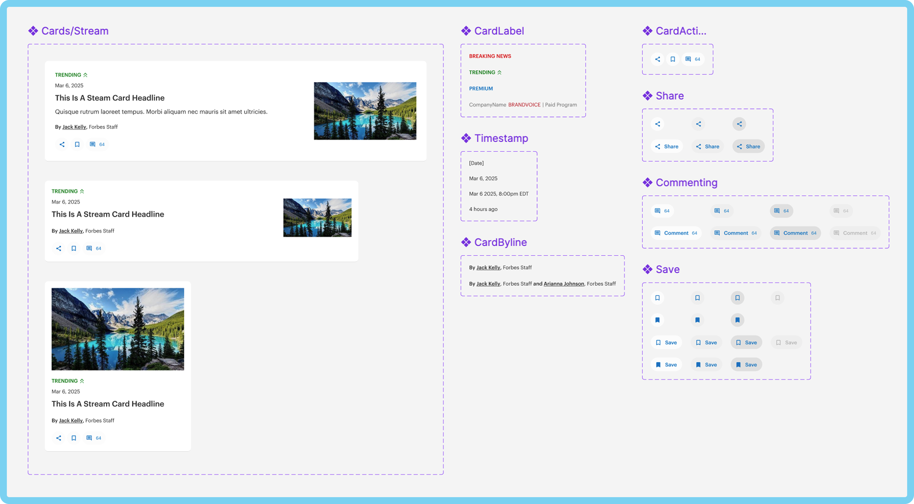
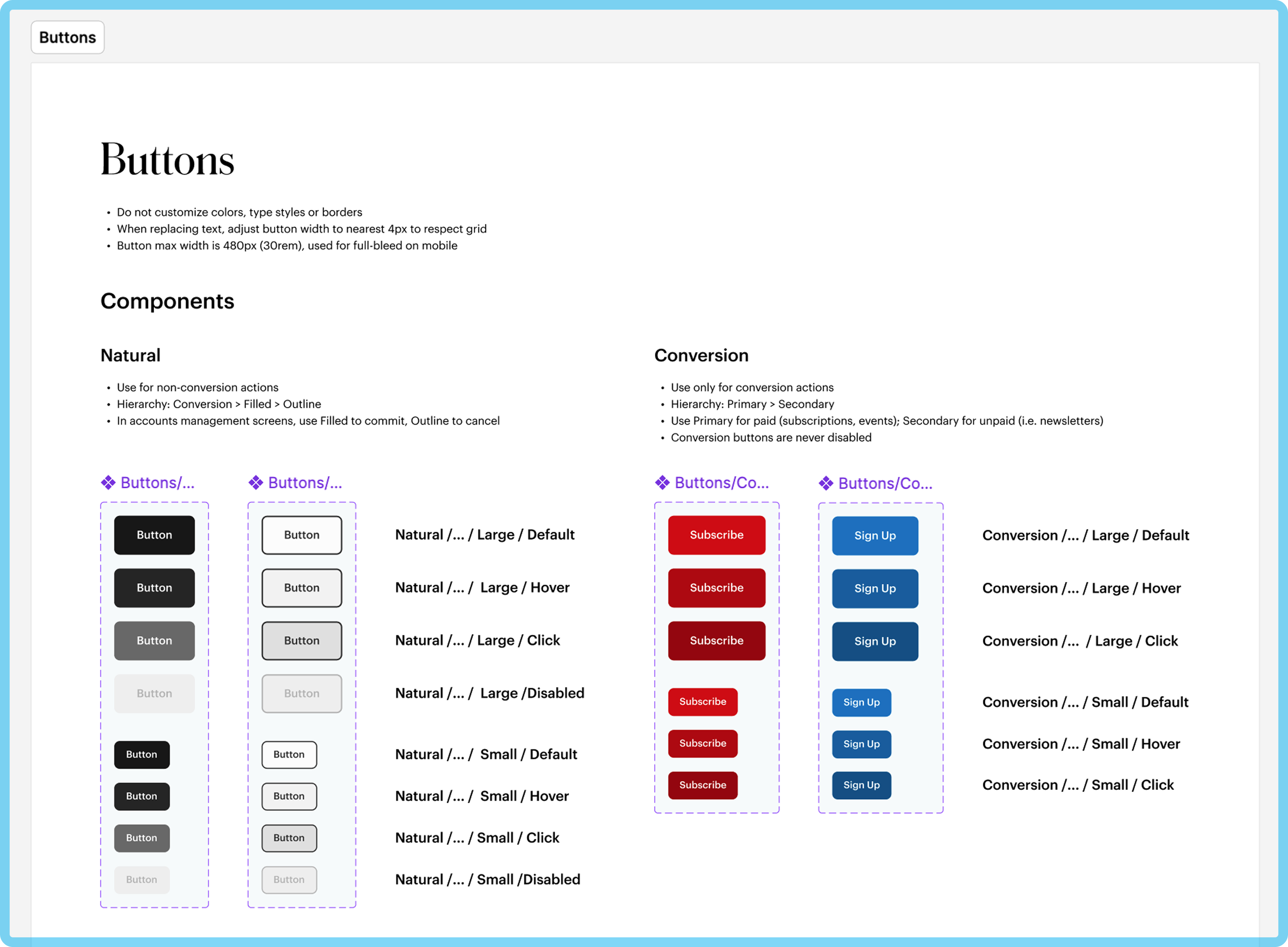
Atomic elements in patterns such as components add flexibility to a design system.
Forbes
Role: Design Director
Duration: Initial phase 4-5 months, then ongoing
Team: Myself, Engineering Lead, 2 External Designers
Atomic elements in patterns such as components add flexibility to a design system.
In 2018, Forbes embarked on a major website redesign in collaboration with an external agency. Although the redesign produced working files and rich visual references, these assets lacked clear guidelines. As the site expanded, different teams at Forbes interpreted the design artifacts in varied ways, which led to visual inconsistencies and increased rework. To address these challenges, we developed a design—a single source of truth—to streamline effort and improve consistency and clarity for all teams.
The redesign introduced new typography, refreshed brand colors, and repeatable UI patterns (e.g., cards). However, with elements scattered across working files (Sketch) and read-only documents (Zeplin), it was hard to establish—let alone enforce—standard practices for their future application. The site was also expanding rapidly at this time, which only compounded some of the problems that we encountered:
Design elements were applied inconsistently across different projects, and new elements were created that departed from the look and feel of the redesign.
These differing interpretations required frequent fixes for both designers and developers.
Lack of a source of truth complicated decision-making and design handoff.
The project had a team of four, including two external partners, and we needed to work quickly in order to prevent the problems stated above from becoming too entrenched. These factors greatly shaped our approach.
We began by auditing the live site to capture the best implementations of the redesign. This allowed us to consolidate redundant elements and identify opportunities to streamline. We found that there were already inconsistencies that needed to be corrected in recently redesigned pages, especially in the application of UI colors.
Due to limited resources, we had to be strategic about what we produced. I focused the team on delivering high-impact items that would be low effort and thus maximize our return on investment.
Through affinity mapping and discussion, we arrived at the decision to focus on atomic elements. This was also supported by the findings from our audit. We honed in on foundations—color, typography, grid, and core UI components—that were both ubiquitous (and therefore, noticeable) yet relatively bite-sized in terms of coding. Because the site had not yet implemented components in the codebase on a broad scale, keeping our budget small was important from both an adoption and maintenance point of view.
Providing scannable documentation makes guidelines easier to understand.
In order to make our decisions actionable in day-to-day work, we created a “core” library of foundations in Sketch, and linked assets from the library to Zeplin’s style guides, thus creating a living document that formed the backbone of the design system. This made it much easier for both designers and developers to identify approved styles, patterns and state-behaviors in their day-to-day, and (down the line) also helped us identify when we needed to amend or append the system.
We documented clear guidelines for usage, including specifications for icons (stroke, sizing, style), typography, grid, and accessibility standards (WCAG). This documentation served as both an instructional manual and a rationale for our design decisions.
In a relatively short time, our small team drafted the foundations of a design system that would grow and scale with our site, solving short-term problems while positioning our teams well for future iterations.
The Core Library—as it came to be known—provided an authoritative source for UI elements for designers. Linking its assets in it to a Zeplin style guide provided a developer reference for common patterns and later, components. Together, these minimized drift and supported a unified visual identity across the site, while reducing the need for rework.
Although siloing between teams hindered adoption early on, the design system ultimately fostered better cross-functional collaboration. It took many conversations to get different teams on the same page, some more successful than others.
Additionally, the atomic nature of the Core Library and its counterpart style guide opened the door for broad application of component-based design and development on the site. This would kick into high gear after I introduced Figma to our organization, and once the engineering department began migrating our templates to React.
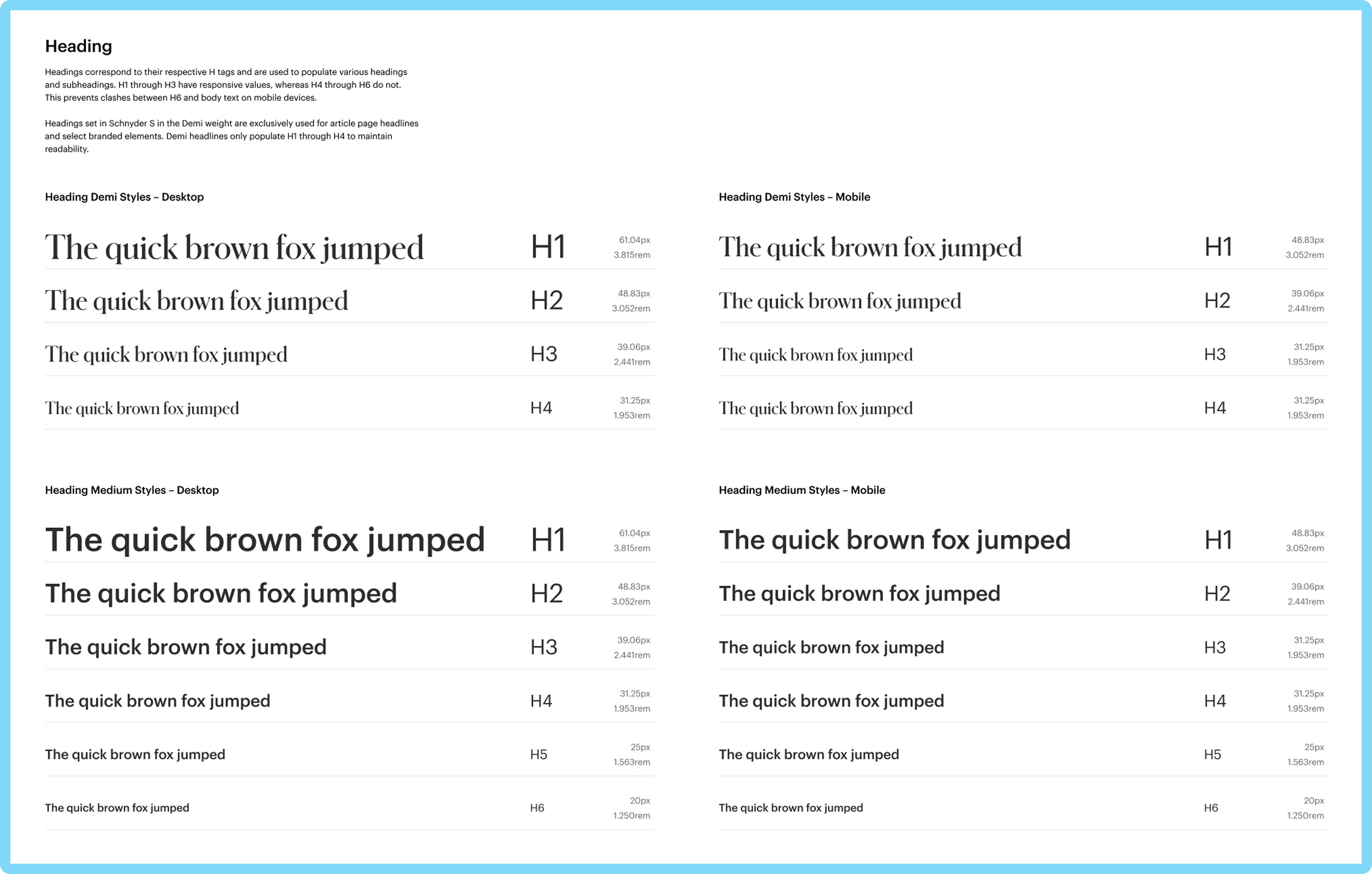
Typographic documentation identifies style names, associated tags or classes, responsive behavior, and units.
This project demonstrates the transformative benefits of creating a design system. By establishing a single source of truth, we reduced visual inconsistencies, accelerated workflows, and built a robust foundation for ongoing innovation. While challenges like team siloing and resource constraints persisted, the design system provided the clarity and consistency necessary to set a north star for Forbes’ evolving digital presence.
Copyright © 2025 Andres Jauregui. All rights reserved.